
Elphi
WEB APP
DASHBOARD DESIGN
TEAM PROJECT
UX RESEARCH
This project was originally done in Spring of 2022. However, as I was building out this portfolio, I took the time to revisit this project to improve the visual design with more years of experience under my belt.
INTRODUCTION
Bringing Clarity to Chaos
It probably comes as no surprise that, behind the scenes, mortgages have a lot of moving parts. As a startup in the mortgage industry, Elphi’s goal is to create one system where operation analysts (OAs) can efficiently prioritize and carry out the numerous tasks needed to close out a loan. After securing its first lending partner, Elphi wants to bring its SaaS product to the next level. My team was tasked with creating the homepage dashboard to improve the way OAs tackled their day-to-day tasks.
Problem
As it stands, most operation analysts are working across multiple platforms every day, such as Outlook, Tableau, Excel, and even hand-written notes. This disjointed process caused significant friction points and bottlenecks
Solution
We designed a homepage that gave underwriters a clear picture of their day: combining task lists, loan statuses, and important updates, all in one place; so they could stop bouncing between platforms and focus on what actually needed their attention.
Research & Insights
Learning the Job to Design for It
Our team started this project completely new to the mortgage industry, as such it was important to make sure we were able to properly communicate with and design for our users. For our initial user-base, we interviewed 6 OAs (3 with less than 3 YOE, and 3 with 4-5 YOE) and one manager. I focused the research plan on finding out not only their painpoints and how they use the system, but the overall process they have to follow and their day-to-day workflow. My aim was to begin establishing trends that would inform design decision in the future.

To go deeper, I lead the team through synthesizing direct quotes and behavioral patterns from interviews into an affinity map - highlighting recurring frustrations, mental models, and unmet needs that pointed to broader systemic issues. These takeaways provided the foundation for defining clear opportunity areas for the redesign.

Understanding the Competition and Where Elphi Fits
With interviews done, and a path forward starting to take shape, next I analyzed three major competitors to understand how they supported users like OAs and where they fell short. Most of this research was conducted by reading articles available on the company's website and other creditable sources.

While these platforms offered a robust LOS tools, the trade-off was often burying users under complex navigation or outdated designs. As none of these platforms focused on streamlined seeing tasks or loan details, it confirmed that Elphi had an opportunity to stand out by focusing on intuitive dashboards, clearer workflows, and tailoring a user experience to how OAs actually work.


Design Process
What Makes the Cut (and What Doesn’t)
The MoSCoW method gave us a shared language for prioritization. With limited time and a long list of possible features, it helped us sort through competing ideas and focus on what would make the greatest impact. By labeling each feature as a Must, Should, Could, or Won’t, we were able to align as a team, avoid scope creep, and make confident decisions based on user pain points and business impact.

Hitting Snags Early
This version of the dashboard went through rounds of usability testing with OAs. We focused on whether the layout and widgets aligned with their actual workflow needs. While the design included several promising ideas, feedback made it clear that many elements weren’t actionable enough to support their day-to-day tasks.

Snapshot Widget
Overall this area would need to include more data to be actionable. OAs wished to instead see the amout of open loans
Flagged Items
Majority of users expected this area to show urgent items that needed attention - such as upcoming due dates and rejected items.
Weekly Snapshot
OAs liked this idea in theory, but would need to be re-worked in order to have any tangible value
Loan Overview
Links to the task summary page, OAs wished they could see what needed attention along with the bar.
The idea behind this layout was to provide OAs with a view of what they found most important - updates, deadlines and loan progression. However, one comment that kept coming up was "This information is nice to know, it's better somewhere else". I felt that this was a great opportunity to pivot and explore a "less is more" approach - have the dashboard focus on showing the OAs workload, and create a seperate page that details the entirety of a loan (tasks, documents, key contacts, etc). Were we asked to create this "loan detail" page, no, but it felt like an incomplete experience to design one page and not include the page OAs would be spending most of their time in.
Personally, this round of testing taught me that even well-intentioned features can fall flat if they don’t immediately serve user priorities. It reinforced the value of early, candid feedback in validating design assumptions and course-correcting before investing too far in the wrong direction.
When Alignment Slips
The team was at a crossroads - one half wanted to continue and refine the design we had, while the other half felt it was better to pivot, keep any good ideas we had, but ultimately start from scratch. At this point in the timeline, we had a little under a week left for this project whichever way we decided.
Given the tight deadline, it was ultimately decided to move forward with the existing design. This approach allowed us to polish what we had, improve where we could, and deliver a dashboard by the end of our sprint. Below is the final design:
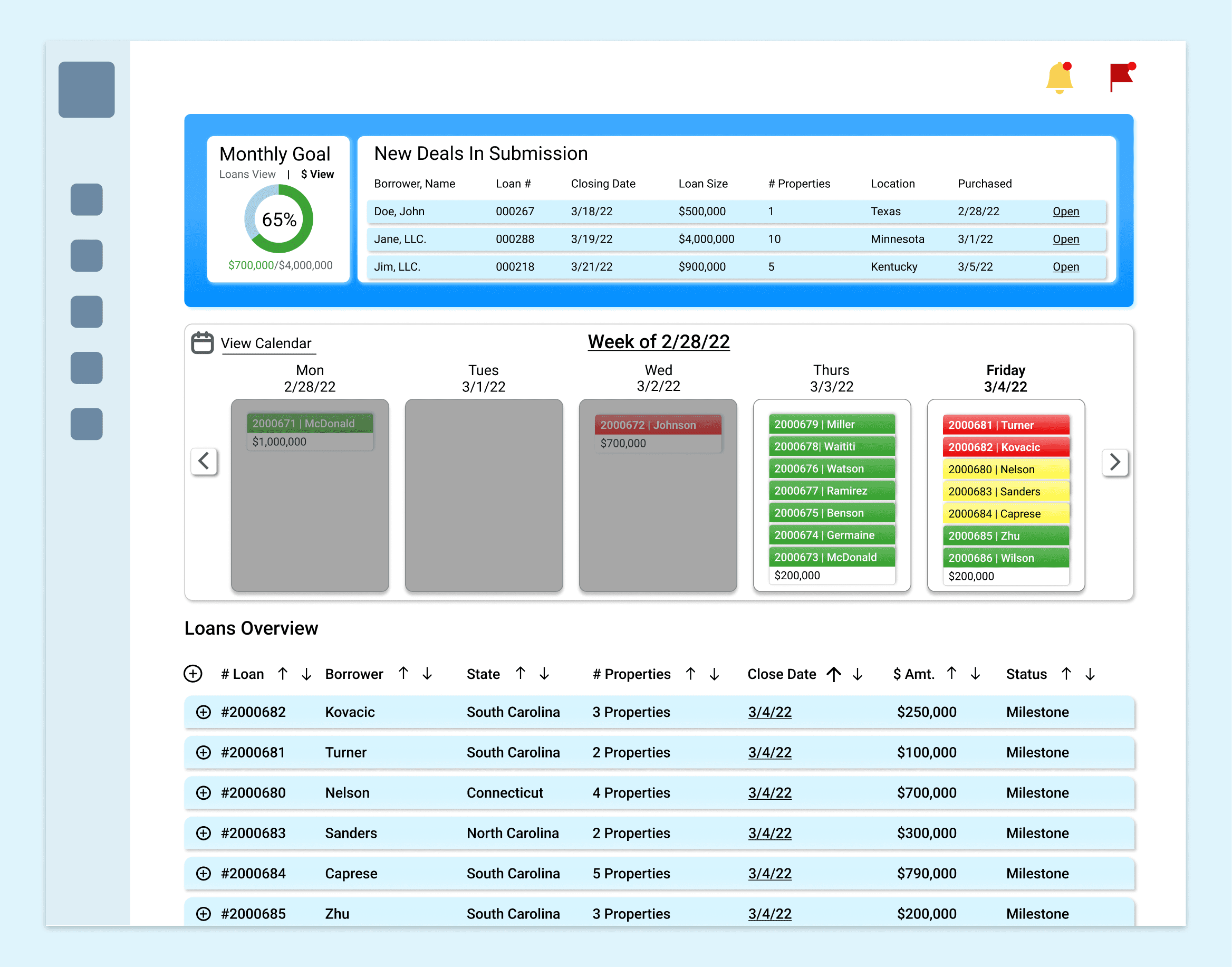
While we didn’t overhaul the design in the final stretch, we refined the visual hierarchy, clarified task statuses, and ensured the core interactions were consistent across the dashboard. The result was a usable, presentable MVP that gave underwriters a high-level overview of their loans, though deeper improvements, especially around data visualization, would need to come later.
When Done Isn’t Quite Finished
Despite some hurdles, this project was a strong collaborative effort that pushed me to think critically about user needs and internal workflows. It sharpened my ability to navigate competing ideas, balance priorities under tight timelines, and advocate for decisions backed by research. While the final product didn’t shift dramatically, the process laid important groundwork for the future of Elphi's product.
Watch for early attachment: Some teammates grew attached to the initial design, which made it harder to pivot even when usability data pointed in another direction. Next time, I’ll advocate early on to reduce tunnel vision.
Balance conviction with collaboration: Navigating a team split between iteration and overhaul taught me the importance of compromise under tight deadlines. We opted to refine rather than rebuild, but it’s a reminder that alignment isn’t just about design, but a combination of other interpersonal factors.
As I stated at the beginning of this case study, there was a 2025 version of the final design. There was no reason to do this besides to stretch my design muscles and show how my visual design and design thinking have improved. I won't be doing any additional research for this version, as I believe our research showed us a clear direction we just missed the mark on the execution - which I hope to correct. Below is a preview:
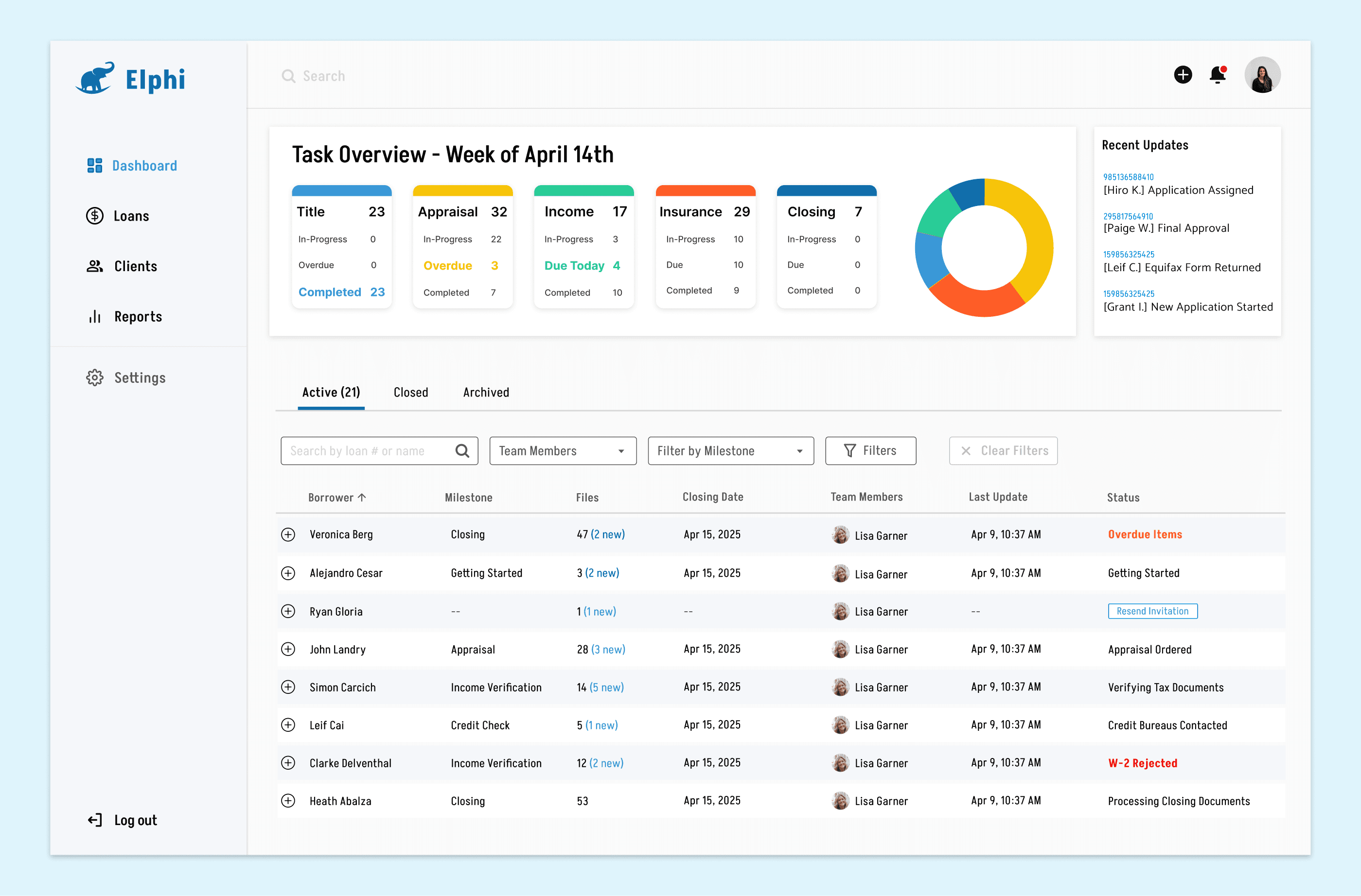
"What would have happened if we started from scratch?", My aim with this revision was to take a step back and really look at what our users were telling us - we had solid feedback and plenty ideas that we couldn't explore due to time.
Overall, four areas stood out to me that could use improvement

Our initial dashboard concept tried to pack as much information as possible into a single view, but this led to visual overload, unclear priorities, and ultimately didn’t support the workflow management like we were aiming for. My revision focused on reducing visual noise and increasing clarity around workload visibility. While the layout is intentionally simple, it directs attention to the most: active loans and their task statuses, allowing users to quickly assess their priorities.
At the same time, the visual design and branding were refined to better align with modern fintech standards, creating a cleaner, more trustworthy experience that reflects Elphi’s goals as an emerging SaaS innovator.

With the dashboard done, I turned my attention to the loan details page. As I stated earlier, it felt odd to only design half the experience when OAs were going to be spending most of their time within a loan file. My goal was to give OAs a clean, task-focused space where they could manage documents, track milestones, and reference borrower details balancing key metrics with clarity and visual breathing room: less noise, more utility
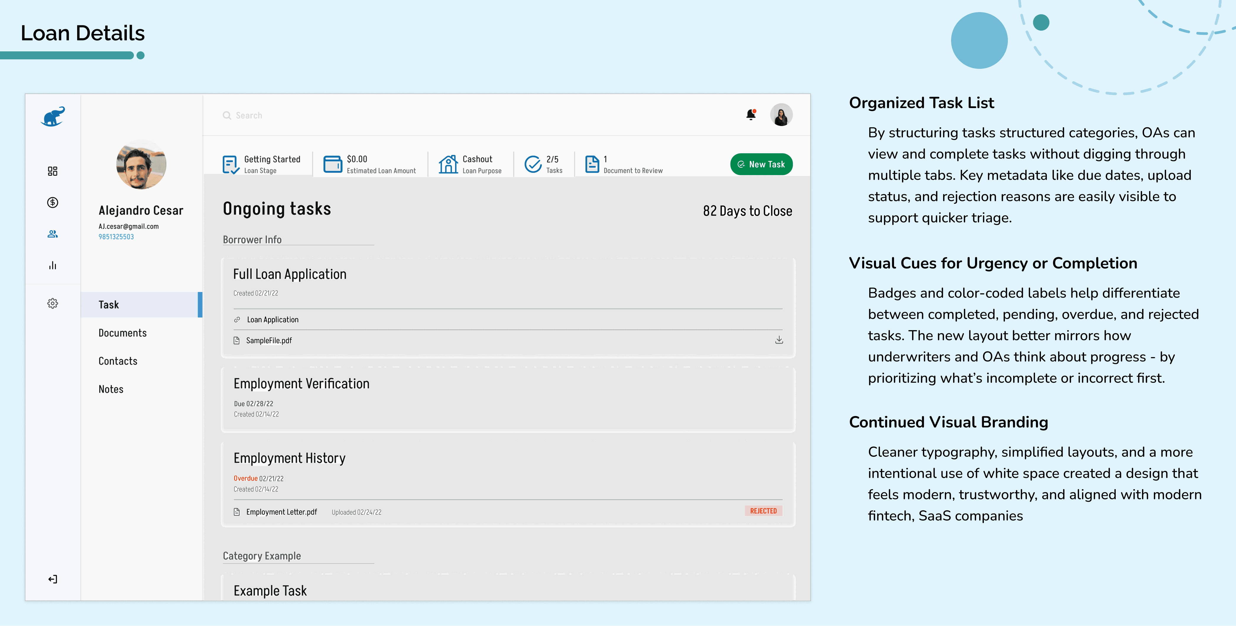
Revision Showcase


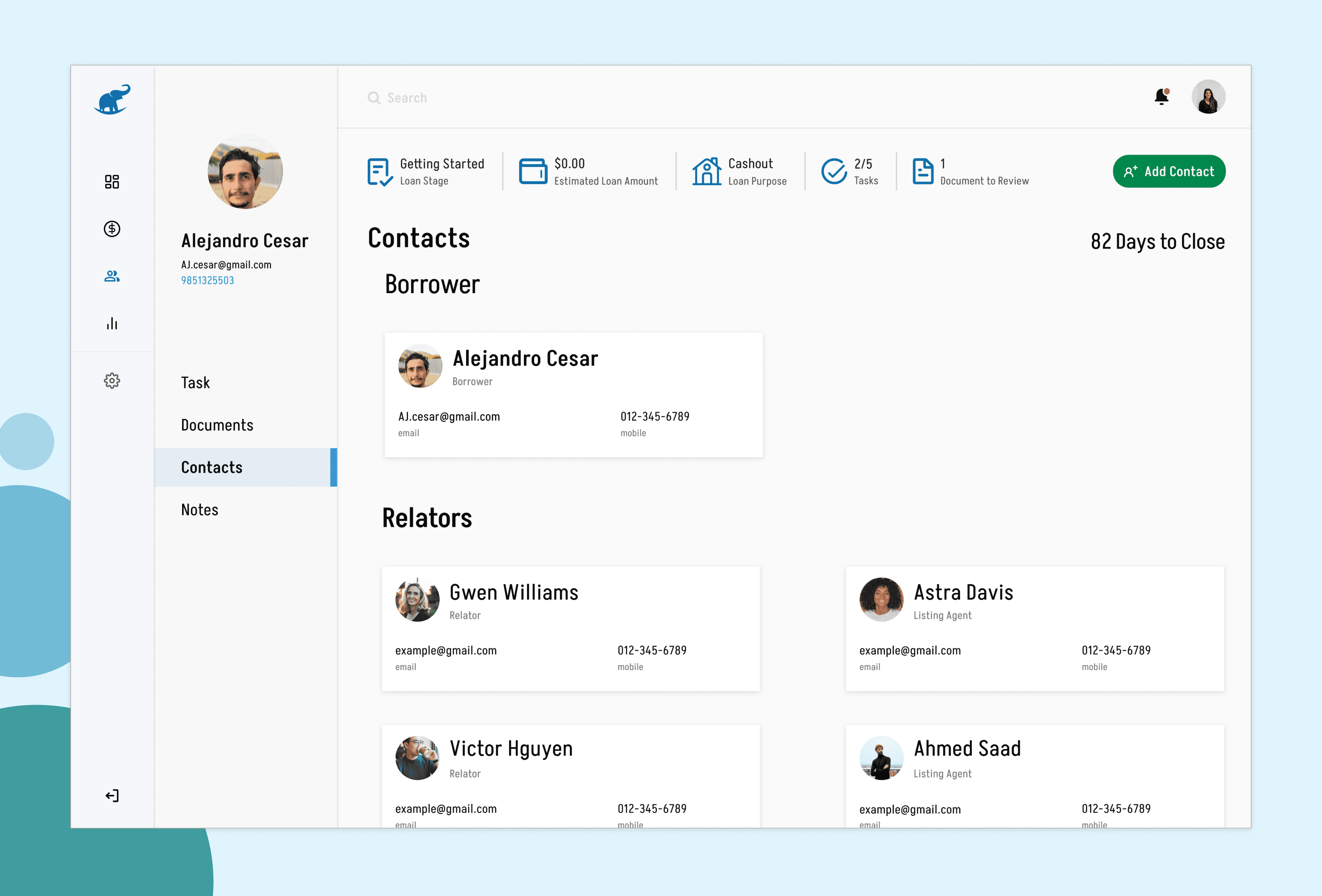


I treated this as a chance to ask, “What if we had started from scratch, knowing everything we know now?” With that mindset, I revisited our feedback, evaluated the design decisions we made under time constraints, and focused on building a more complete, thoughtful experience. While our original concept met the basic project requirements, it was clear we missed the mark on several areas. The dashboard was meant to support workflow visibility, but without the supporting loan detail pages, it lacked the depth and functionality needed for users to manage their tasks effectively.
By revisiting this project, I gained a deeper appreciation for asking the right questions early, pushing back when something feels incomplete, and designing with a more holistic, systems-thinking mindset. It’s a reminder that good design isn’t just about polish — it’s about solving the right problems, even if that means (sometimes) going beyond what was originally asked.


