Calista Dunbar
Menu
Calista Dunbar
Menu
Calista Dunbar
Menu
Naka-Kon
Naka-Kon
END-TO-END
END-TO-END
END-TO-END
WEBSITE REDESIGN
WEBSITE REDESIGN
WEBSITE REDESIGN
SOLO PROJECT
SOLO PROJECT
SOLO PROJECT
7 months / Part-Time
7 months / Part-Time
Fall 2024 - Spring 2025
Fall 2024 - Spring 2025
Heuristic Analysis, Content & IA Audit, Competitive Analysis, Sitemapping, Wireframing, Prototyping, Usability Testing
Heuristic Analysis, Content & IA Audit, Competitive Analysis, Sitemapping, Wireframing, Prototyping, Usability Testing
INTRODUCTION
A Digital Refresh to Celebrate 25 Years
Naka-Kon, an anime convention in Kansas City, has been bringing anime fans together for 25 years, but you wouldn't know by looking at their website. While conventions heavily rely on social media to reach their attendees, the website is the central hub where everything comes together: it where attendees purchase badges and any add-ons (the main source of revenue for Naka-Kon), volunteers and vendors look for ways to get involved, and how sponsors determine who to support. A strong website not only provides information but also previews the convention experience and sets expectations for what attendees will find when they arrive.
Problem
Naka-Kon’s website felt outdated and hard to use, hiding important content like schedules and sign-ups. Instead of showcasing its long history, it left poor first impressions and made it harder for attendees, volunteers, and sponsors to engage.
Solution
The redesign created a site as welcoming as the convention itself, with clear navigation, improved content structure, and a refreshed look. The result is a modern hub that makes information easy to find and supports a smoother, stress-free weekend.
Before and After Design Preview
Homepage
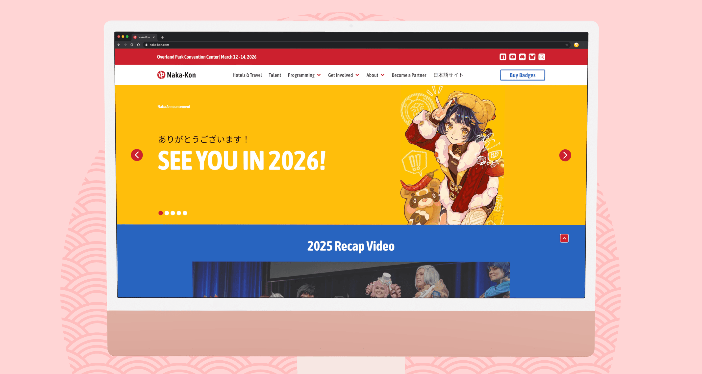
The original homepage was static and text-heavy, burying important updates. Redesigned with a new dynamic banner, clear navigation, and structured highlights now make it feel like the true start of the convention.
User Impressions
Simplified navigation, increasing click-through to key sections like Guests, Schedule, and Registration by 32%.
Dynamic banner updates increased visibility for important convention news, ensuring attendees stayed informed without extra clicks.
“This looks awesome - the whole page feels alive and shows the Nakama spirit!"
Schedule
The old schedule was an endless list that left attendees lost and unsure. Replaced with a color-coded, filterable grid organizes events by time and room, making it easy to scan and make the most out of the weekend.
User Impressions
Color-coded event blocks improved scannability and helped users find relevant programming 28% faster.
Filterable daily tabs reduced scrolling fatigue and made it easier for attendees to plan their weekend at a glance.
" I only go to conventions for specific panels, but I would like to check out what other programming there is to see. A color-coded schedule is such a good idea"
Volunteer
The volunteer page once overwhelmed users with dense text. Breaking content into scannable sections with icons and clear CTAs makes the page approachable and better communicates both requirements and perks.
User Impressions
Breaking content into sections made requirements and perks easier to understand, improving clarity by 40%.
Icon-supported layouts made the page more inviting and helped users identify roles that matched their skills and interests.
“This is so much better, I can easily see what's expected of me and what perks I get. Plus it's much more inviting that I might actually apply."
INTRODUCTION
INTRODUCTION
A Digital Refresh to Celebrate 25 Years
A Digital Refresh to Celebrate 25 years
Naka-Kon, an anime convention in Kansas City, has been bringing anime fans together for 25 years, but you wouldn't know by looking at their website. While conventions heavily rely on social media to reach their attendees, the website is the central hub where everything comes together: it where attendees purchase badges and any add-ons (the main source of revenue for Naka-Kon), volunteers and vendors look for ways to get involved, and how sponsors determine who to support. A strong website not only provides information but also previews the convention experience and sets expectations for what attendees will find when they arrive.
Naka-Kon, an anime convention in Kansas City, has been bringing anime fans together for 25 years, but you wouldn't know by looking at their website. While conventions heavily rely on social media to reach their attendees, the website is the central hub where everything comes together: it where attendees purchase badges and any add-ons (the main source of revenue for Naka-Kon), volunteers and vendors look for ways to get involved, and how sponsors determine who to support. A strong website not only provides information but also previews the convention experience and sets expectations for what attendees will find when they arrive.
Problem
Problem
Naka-Kon’s website felt outdated and hard to use, hiding important content like schedules and sign-ups. Instead of showcasing its long history, it left poor first impressions and made it harder for attendees, volunteers, and sponsors to engage.
Naka-Kon’s website felt outdated and hard to use, hiding important content like schedules and sign-ups. Instead of showcasing its long history, it left poor first impressions and made it harder for attendees, volunteers, and sponsors to engage.
Solution
Solution
The redesign created a site as welcoming as the convention itself, with clear navigation, improved content structure, and a refreshed look. The result is a modern hub that makes information easy to find and supports a smoother, stress-free weekend.
The redesign created a site as welcoming as the convention itself, with clear navigation, improved content structure, and a refreshed look. The result is a modern hub that makes information easy to find and supports a smoother, stress-free weekend.
Before and After Design Preview
Before and After Design Preview
Homepage
Homepage
The original homepage was static and text-heavy, burying important updates. Redesigned with a new dynamic banner, clear navigation, and structured highlights now make it feel like the true start of the convention.
The original homepage was static and text-heavy, burying important updates. Redesigned with a new dynamic banner, clear navigation, and structured highlights now make it feel like the true start of the convention.
User Impressions
User Impressions
Simplified navigation, increasing click-through to key sections like Guests, Schedule, and Registration by 32%.
Simplified navigation, increasing click-through to key sections like Guests, Schedule, and Registration by 32%.
Dynamic banner updates increased visibility for important convention news, ensuring attendees stayed informed without extra clicks.
Dynamic banner updates increased visibility for important convention news, ensuring attendees stayed informed without extra clicks.
“This looks awesome - the whole page feels alive and shows the Nakama spirit!"
“This looks awesome - the whole page feels alive and shows the Nakama spirit!"
Schedule
Schedule
The old schedule was an endless list that left attendees lost and unsure. Replaced with a color-coded, filterable grid organizes events by time and room, making it easy to scan and make the most out of the weekend.
The old schedule was an endless list that left attendees lost and unsure. Replaced with a color-coded, filterable grid organizes events by time and room, making it easy to scan and make the most out of the weekend.
User Impressions
User Impressions
Color-coded event blocks improved scannability and helped users find relevant programming 28% faster.
Color-coded event blocks improved scannability and helped users find relevant programming 28% faster.
Filterable daily tabs reduced scrolling fatigue and made it easier for attendees to plan their weekend at a glance.
Filterable daily tabs reduced scrolling fatigue and made it easier for attendees to plan their weekend at a glance.
" I only go to conventions for specific panels, but I would like to check out what other programming there is to see. A color-coded schedule is such a good idea"
" I only go to conventions for specific panels, but I would like to check out what other programming there is to see. A color-coded schedule is such a good idea"
Volunteer
Volunteer
The volunteer page once overwhelmed users with dense text. Breaking content into scannable sections with icons and clear CTAs makes the page approachable and better communicates both requirements and perks.
The volunteer page once overwhelmed users with dense text. Breaking content into scannable sections with icons and clear CTAs makes the page approachable and better communicates both requirements and perks.
User Impressions
User Impressions
Breaking content into sections made requirements and perks easier to understand, improving clarity by 40%.
Breaking content into sections made requirements and perks easier to understand, improving clarity by 40%.
Icon-supported layouts made the page more inviting and helped users identify roles that matched their skills and interests.
Icon-supported layouts made the page more inviting and helped users identify roles that matched their skills and interests.
“This is so much better, I can easily see what's expected of me and what perks I get. Plus it's much more inviting that I might actually apply."
“This is so much better, I can easily see what's expected of me and what perks I get. Plus it's much more inviting that I might actually apply."
RESEARCH
Finding the Gaps
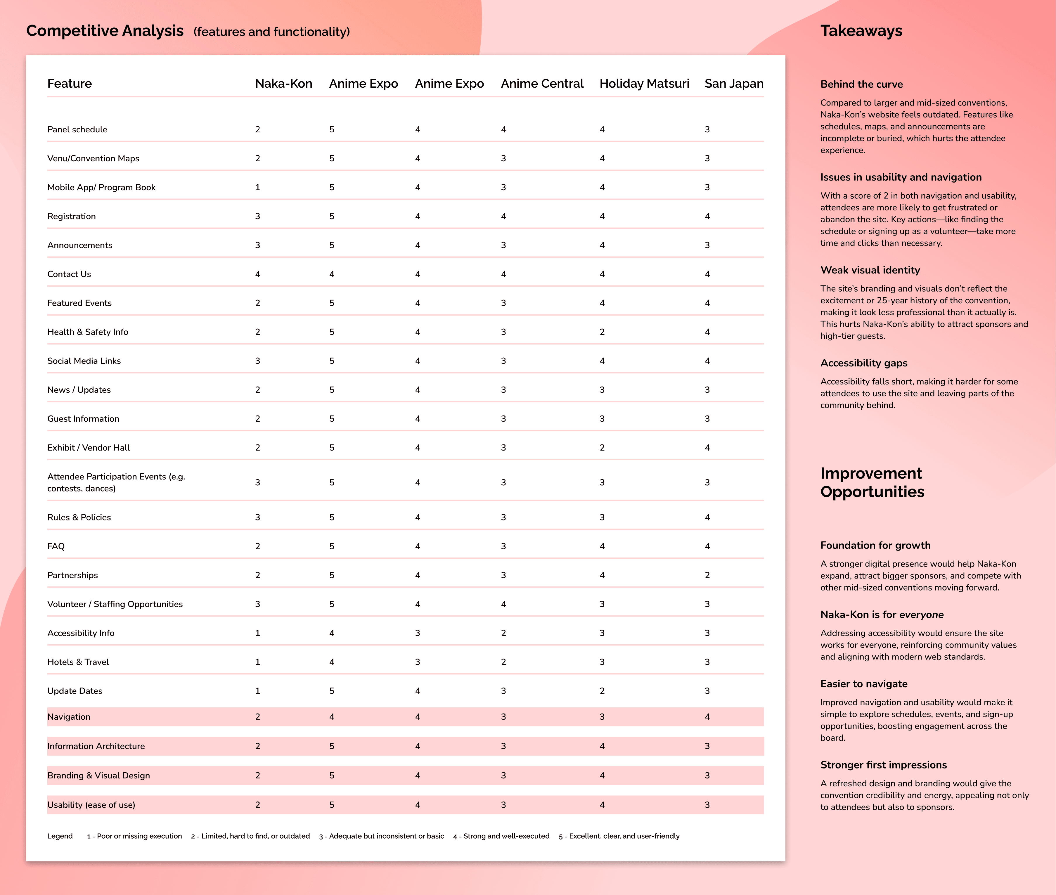
With little direction besides "I trust your professional judgement," - where was I supposed to start? A quick look at the site made it clear it needed more than just a content update. From the cluttered layout and lack of information hierarchy to the outdated visuals that didn't speak to Naka-Kon's vibrant history, a usability and design evaluation was the right place to start.
I had 3 volunteers complete a usability test - people who watched anime, but knew nothing about conventions.

Taking Notes from the Best
With hundreds of conventions for to reference, I picked a mix of "A-tier" conventions and those that were closer in size to Naka-Kon. The larger conventions provided ideas on how to structure content, communicate the brand, and create clear navigation; while the similarly-sized conventions showed how to do more with less. Together, this is the balance I wanted to strike with the redesign: pair the polish and professionalism of larger events with the accessibility and community feel that makes Naka-Kon what it is.


DESIGN GOALS
Laying the Groundwork
With gaps identified and improvement opportunities in mind, I turned my focus to goal setting. I outlined the following goals that aimed to make the site functional, but to also reflect Naka-Kon as a beloved, modern convention: Streamlined Navigation, Highlight High-Value Content, Improve Usability and Accessibility, and Modernize Branding & Visuals.

UX CHALLENGES
Tackling UX Challenges
These aren’t all the challenges I worked through during the redesign, but they represent the ones that have the biggest impact on Naka-Kon's goals and attendee experience. Examples highlight a core usability issue with the original site and shows how the redesign helped simplify navigation, reduce friction, or create a more engaging way for fans to interact with Naka-Kon online.
Challenge 1: Mapping the Experience
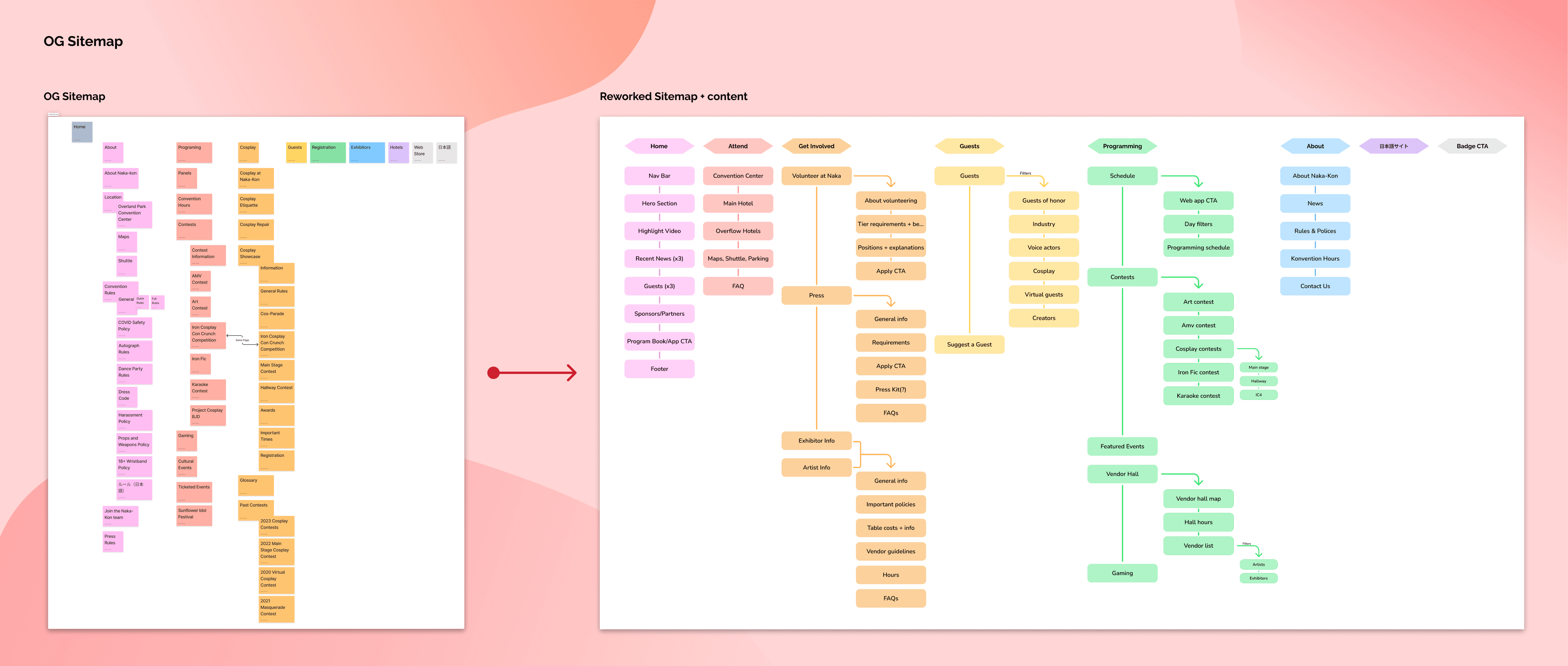
The original sitemap was cluttered and inconsistent. Important content like registration, contests, and programming was split across multiple sections, while policies and cosplay details were buried under long lists of separate pages. Instead of guiding users, the structure forced them to dig through redundant categories, making even simple tasks confusing.
As the site had to be usable by both new (those new to conventions and new to Naka-Kon) and veteran (frequent con-goers and those who have attended Naka-Kon in the past) attendees, I had a few people complete a card sort exercise to determine the most logical way to group pages. In the reworked sitemap, I reorganized content into clear, attendee-focused categories:
Challenge 2: Homepage & Content Hierarchy
Since the homepage acts as the convention’s first impression, it needed to welcome new attendees, guide returning fans, and give visibility to involvement opportunities like sponsorships or being an exhibitor. Instead, the old design created friction at nearly every level: the hero section was static, the menu was overwhelming, main content had no clear hierarchy to determine announcement was more important, and the footer offered little utility. With this done, I got into the mindset of thinking about the issues with the website at a fundamental level to identify clear improvement opportunities that would shape the direction of the redesign.
While I initially started in low-fidelity wireframes, I quickly switched to high-fidelity screens. As many of the staff on Naka-Kon's team were unfamiliar with UX design, it was easier to gather feedback and communicate designs with "fleshed out" screens. That being said, I did create different versions of screens, working through different ideas for layout, content order, and overall presentation.

From Audit to Action
Using those insights, I crafted the homepage into a true introduction to the Naka-Kon experience. The new design focused on attendee-focused content, a striking hero image and rich visuals that preview the weekend. Together, these changes made the homepage more engaging, easier to navigate, and better aligned with the energy of the event.

Challenge 3: Leveling Up the Schedule
The original schedule relied on long vertical lists of events stacked by time, which quickly became overwhelming. While functional, this approach created several usability issues: attendees had to scroll extensively, events looked nearly identical, and there was no easy way to filter by interest.
To solve these challenges, I shifted the design toward a grid-based calendar view organized by time and room. This layout aligns with how attendees naturally think about planning — asking “what’s happening at this time, in this room?” rather than parsing an endless list.
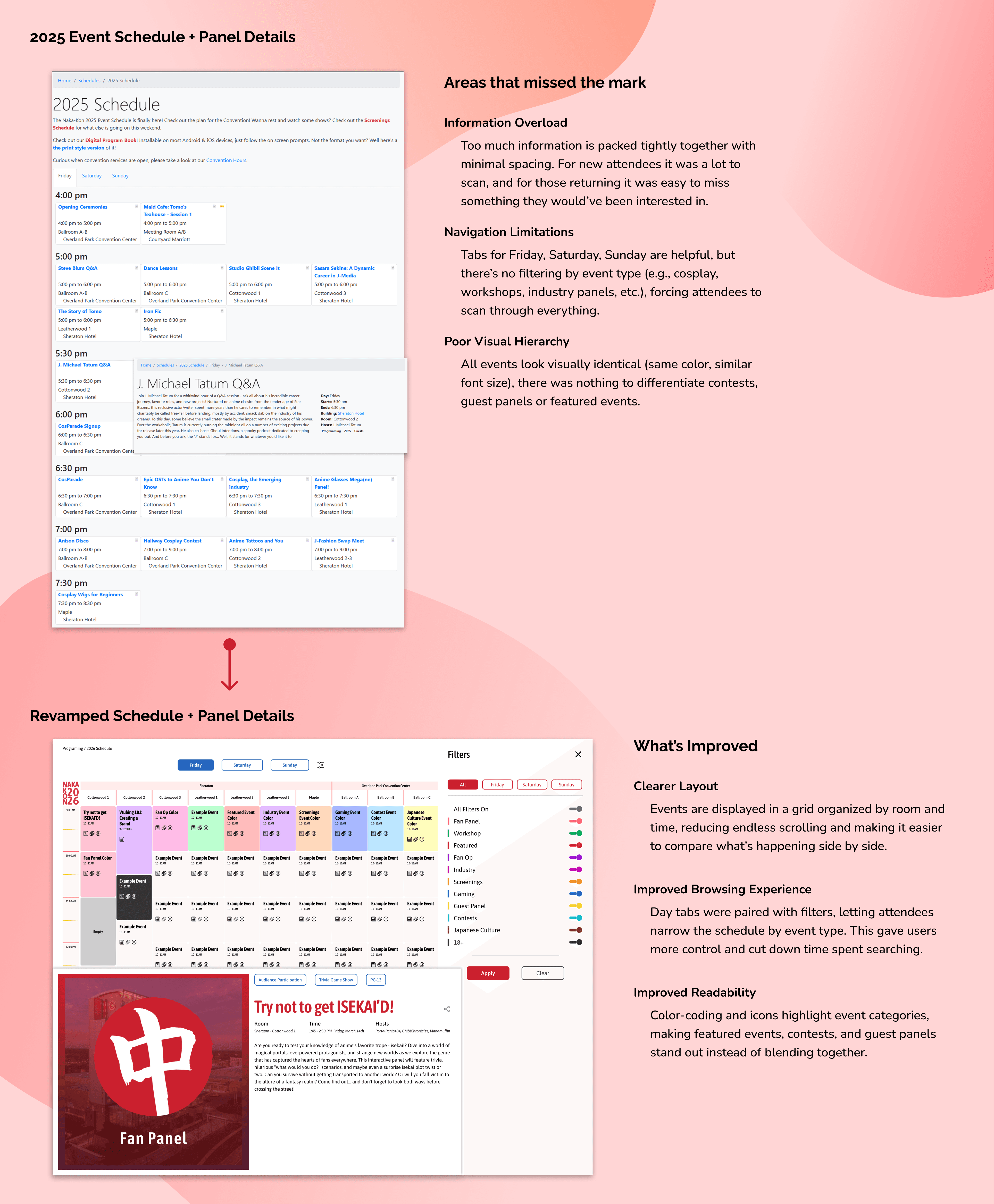
Note: This format is not well-suited to mobile and would need to be redesigned to fit mobile devices specifically.
RESEARCH
Finding the Gaps
With little direction besides "I trust your professional judgement", where was I supposed to start? A quick look at the site made it clear - it needed more than just a content update. From the cluttered layout and lack of information hierarchy to the outdated visuals that didn't speak to Naka-Kon's vibrant history, a usability and design evaluation was the right place to start.
I had 3 volunteers complete a usability test - people who watched anime, but knew nothing about conventions.

Taking Notes from the Best
With hundreds of conventions for to reference, I picked a mix of "A-tier" conventions and those that were closer in size to Naka-Kon. The larger conventions provided ideas on how to structure content, communicate the brand, and create clear navigation; while the similarly-sized conventions showed how to do more with less. Together, this is the balance I wanted to strike with the redesign: pair the polish and professionalism of larger events with the accessibility and community feel that makes Naka-Kon what it is.
RESEARCH
Finding the Gaps
With little direction besides "I trust your professional judgement", where was I supposed to start? A quick look at the site made it clear it needed more than just a content update. From the cluttered layout and lack of information hierarchy to the outdated visuals that didn't speak to Naka-Kon's vibrant history, a usability and design evaluation was the right place to start.
I had 3 volunteers complete a usability test - people who watched anime, but knew nothing about conventions.
Taking Notes from the Best
With hundreds of conventions for to reference, I picked a mix of "A-tier" conventions and those that were closer in size to Naka-Kon. The larger conventions provided ideas on how to structure content, communicate the brand, and create clear navigation; while the similarly-sized conventions showed how to do more with less. Together, this is the balance I wanted to strike with the redesign: pair the polish and professionalism of larger events with the accessibility and community feel that makes Naka-Kon what it is.
DESIGN GOALS
Laying the Groundwork
With gaps identified and improvement opportunities in mind, I turned my focus to goal setting. I outlined goals that aimed to make the site functional, but to also reflect Naka-Kon as a beloved, modern convention.
UX CHALLENGES
Tackling UX Challenges
These aren’t all the challenges I worked through during the redesign, but they represent the ones that had the biggest impact on the attendee experience. Each example highlights a core usability issue with the original site and shows how the redesign helped simplify navigation, reduce friction, and create a more engaging way for fans to interact with Naka-Kon online.
Challenge 1: Mapping the Experience
The original sitemap was cluttered and inconsistent. Important content like registration, contests, and programming was split across multiple sections, while policies and cosplay details were buried under long lists of separate pages. Instead of guiding users, the structure forced them to dig through redundant categories, making even simple tasks confusing.
As the site had to be usable by both new (those new to conventions and new to Naka-Kon) and veteran (frequent con-goers and those who have attended Naka-Kon in the past) attendees, I had a few people complete a card sort exercise to determine the most logical way to group pages. In the reworked sitemap, I reorganized content into clear, audience-focused categories:
Challenge 2: Homepage & Content Hierarchy
Since the homepage acts as the convention’s first impression, it needed to welcome new attendees, guide returning fans, and give visibility to involvement opportunities like sponsorship or being a vendor. Instead, the old design created friction at nearly every level: the hero section provided little information, the menu was overwhelming, the content feed buried important updates, and the footer offered little utility. With this done, I got into the mindset of thinking about the issues with the website at a fundamental level to identify clear improvement opportunities that would shape the direction of the redesign.
While I initially started in low-fidelity wireframes, I quickly switched to high-fidelity screens. As many of the staff on Naka-Kon's team were unfamiliar with UX design, it was easier to gather feedback and communicate designs with "fleshed out" screens. That being said, I did create different versions of screens, working through different ideas for layout, content order, and overall presentation.
From Audit to Action
Using those insights, I crafted the homepage into a true introduction to the Naka-Kon experience. The new design focused on attendee-focused content, a dynamic hero carousel and rich visuals that preview the weekend. Together, these changes made the homepage more engaging, easier to navigate, and better aligned with the energy of the event.
Challenge 3: Leveling Up the Schedule
The original schedule relied on long vertical lists of events stacked by time, which quickly became overwhelming. While functional, this approach created several usability issues: attendees had to scroll extensively, events looked nearly identical, and there was no easy way to filter by interest.
To solve these challenges, I shifted the design toward a grid-based calendar view organized by time and room. This layout aligns with how attendees naturally think about planning — asking “what’s happening at this time, in this room?” rather than parsing an endless list.
Note: This format is not well-suited to mobile and would need to be redesigned to fit mobile devices specifically.
DESIGN GOALS
Laying the Groundwork
With gaps identified and improvement opportunities in mind, I turned my focus to goal setting. I outlined goals that aimed to make the site functional, but to also reflect Naka-Kon as a beloved, modern convention.
UX CHALLENGES
Tackling UX Challenges
These aren’t all the challenges I worked through during the redesign, but they represent the ones that had the biggest impact on the attendee experience. Each example highlights a core usability issue with the original site and shows how the redesign helped simplify navigation, reduce friction, and create a more engaging way for fans to interact with Naka-Kon online.
Challenge 1: Mapping the Experience
The original sitemap was cluttered and inconsistent. Important content like registration, contests, and programming was split across multiple sections, while policies and cosplay details were buried under long lists of separate pages. Instead of guiding users, the structure forced them to dig through redundant categories, making even simple tasks confusing.
As the site had to be usable by both new (those new to conventions and new to Naka-Kon) and veteran (frequent con-goers and those who have attended Naka-Kon in the past) attendees, I had a few people complete a card sort exercise to determine the most logical way to group pages. In the reworked sitemap, I reorganized content into clear, audience-focused categories:
Challenge 2: Homepage & Content Hierarchy
Since the homepage acts as the convention’s first impression, it needed to welcome new attendees, guide returning fans, and give visibility to involvement opportunities like sponsorship or being a vendor. Instead, the old design created friction at nearly every level: the hero section was static, the menu was overwhelming, the content feed buried important updates, and the footer offered little utility. With this done, I got into the mindset of thinking about the issues with the website at a fundamental level to identify clear improvement opportunities that would shape the direction of the redesign.
While I initially started in low-fidelity wireframes, I quickly switched to high-fidelity screens. As many of the staff on Naka-Kon's team were unfamiliar with UX design, it was easier to gather feedback and communicate designs with "fleshed out" screens. That being said, I did create different versions of screens, working through different ideas for layout, content order, and overall presentation.
From Audit to Action
Using those insights, I crafted the homepage into a true introduction to the Naka-Kon experience. The new design focused on attendee-focused content, a dynamic hero carousel and rich visuals that preview the weekend. Together, these changes made the homepage more engaging, easier to navigate, and better aligned with the energy of the event.
Challenge 3: Leveling Up the Schedule
Note: This format is not well-suited to mobile and would need to be redesigned to fit mobile devices specifically.
The original schedule relied on long vertical lists of events stacked by time, which quickly became overwhelming. While functional, this approach created several usability issues: attendees had to scroll extensively, events looked nearly identical, and there was no easy way to filter by interest.
To solve these challenges, I shifted the design toward a grid-based calendar view organized by time and room. This layout aligns with how attendees naturally think about planning — asking “what’s happening at this time, in this room?” rather than parsing an endless list.
TESTING & REFINE
TESTING & REFINE
TESTING & REFINE
What Worked, and What Didn't
What Worked, and What Didn't
What Worked, and What Didn't
With the prototype in a good place, it was time for another round of usability testing. In addition to the 3 volunteers I had for the first usability test with the orignal site, I also grabbed a few members of the Naka-Kon team for more specific kon-related improvements.
With the prototype in a good place, it was time for another round of usability testing. In addition to the 3 volunteers I had for the first usability test with the orignal site, I also grabbed a few members of the Naka-Kon team for more specific kon-related improvements.

Better Utalizing the Header
Better Utalizing the Header
The header was redesigned to support both static hero images and a carousel, giving flexibility to highlight a single important announcement or rotate through multiple updates depending on the convention’s needs.
The header was redesigned to support both static hero images and a carousel, giving flexibility to highlight a single important announcement or rotate through multiple updates depending on the convention’s needs.


Giving the Eye a Break
Giving the Eye a Break
Improved listable content (rules, faqs, etc.) by creating collapsible sections makes the information more digestible, allowing attendees to expand only what’s relevant while keeping the page clean.
Improved listable content (rules, faqs, etc.) by creating collapsible sections makes the information more digestible, allowing attendees to expand only what’s relevant while keeping the page clean.

Increasing the Appeal of Volunteering
Increasing the Appeal of Volunteering
The volunteer page was revised to move away from a text-heavy layout toward a more approachable and visually balanced format. By breaking requirements, perks, and roles into clear sections with supporting icons, the page is easier to scan, more inviting, and better highlights the excitement of joining the volunteer team.
The volunteer page was revised to move away from a text-heavy layout toward a more approachable and visually balanced format. By breaking requirements, perks, and roles into clear sections with supporting icons, the page is easier to scan, more inviting, and better highlights the excitement of joining the volunteer team.

SHOWCASE + WHAT'S NEXT
SHOWCASE + WHAT'S NEXT
Closing Ceremonies


What's Next - the At-Kon Experience
With the website done for now, I can turn my attention to the companion app - a dedicated app that would give attendees the flexibility to carry schedules, maps, and announcements in their pocket, removing the need to pull up the website while walking around the convention hall.
With the website done for now, I can turn my attention to the companion app - a dedicated app that would give attendees the flexibility to carry schedules, maps, and announcements in their pocket, removing the need to pull up the website while walking around the convention hall.
My idea for the mobile app would be to incorporate personalized schedules, push-notitifations for last minute changes, and interactive maps to help navigate the exhibitor hall and panel rooms.
My idea for the mobile app would be to incorporate personalized schedules, push-notitifations for last minute changes, and interactive maps to help navigate the exhibitor hall and panel rooms.


